top of page
Acerca de

Branding Project: Bright Concepts
An introduction to bright concepts
Bright Concepts is a social media marketing company that assists clients in developing and creating unique, personalized content for social media pages regarding a variety of businesses and services. Bright Concepts is dedicated to working side by side with clients to construct the perfect blend of content to further promote businesses and boost the overall awareness and engagement among their social platforms.
Overview of the color set
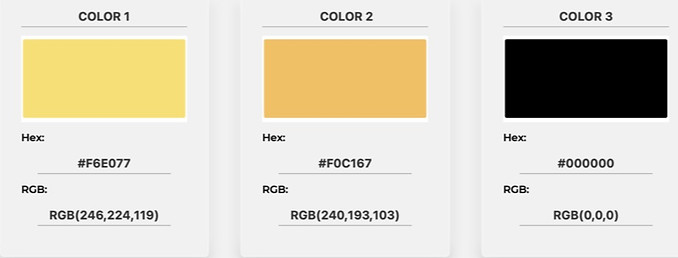
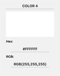
The Bright Concepts color set focuses on the use of vivid pastels that represents the company in a way that is warm, inviting, and friendly. The use of the color yellow is to represent the inspiring nature of Bright Concepts and the abundance of imaginative ideas and designs that the company can offer to its clients. The company's use of the color orange is to represent the creativity and innovation behind Bright Concepts, as this will relate to the work being done for clients regarding social media posts and other related design content. These two colors are joined with both white and black to add contrast between the pastel colors, as well as make for easier readability, resulting in reduced eye strain.
Overview of the Font Set
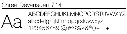
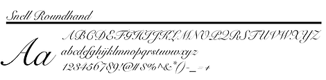
Bright Concepts is represented by Shree Devanagari 714 and Snell Roundhand. Shree Devanagari 714 will be used for large heading text, including but not limited to titles, subheadings, and other texts that require easy readability. Snell Roundhand will be used as a more decorative font to be used for design purposes when necessary. Snell Roundhand is not as easily legible, so it will not be used for paragraph text or subheadings.
Overview of the logo design
The Bright Concepts logo features a light bulb, which is meant to represent the creation of ideas, directly correlating to Bright Concepts and their mission to help clients brainstorm new content for social media outlets. The use of the Blur effect gives off the impression that the bulb is glowing, along with the word "concepts", which was designed to replicate the filament glowing inside of a light bulb.

Logo usage
The Bright Concepts logo should not be used in a way that contradicts or conflicts with company guidelines and practices. The logo should not be reshaped, distorted, or changed in any way to preserve the readability and design of the logo. The logo should not be presented with any other colors than that of the original logo design, to ensure a consistent image is being used to represent the company. The following is an example that represents the misuse and alteration of the Bright Concepts logo, thus violating company guidelines.

Sources of Inspiration

One of the parts inside of the light bulb, the filament, served as a primary source of inspiration behind the selection of the font used in the logo. Snell Roundhand is a cursive style font and is used in the Bright Concepts logo to resemble the kinks and loops that a strand of filament would have. The filament of a light bulb also inspired the choice of color used for this font, as filament typically glows at a yellow-orange hue.

The Pixar Animation Studios logo served as a primary source of inspiration for the Bright Concepts logo. In the Pixar logo, a small lamp is used to resemble the "I" in Pixar. In the creation of the Bright Concepts logo, a light bulb was used to replace the "I" in the word bright.

The light bulb was a major source of inspiration for the logo design, as it symbolizes invention, intelligence, and awareness. The development of new ideas is what Bright Concepts is all about, so the use of the light bulb during the construction of the logo was crucial in conveying the theme of the brand.
bottom of page